Momma Tried, a new print-only magazine, released its premier issue last month. Yes, that’s right — print only — even for subscribers. Sure, MT has social media accounts, a blog, and a website to boot, but none of these platforms unlocks full-fledged content exhibited in the physical publication. This New Orleans arts, literature, and nudie magazine not only participates in the survival of the print media, it celebrates it. In it, Editor Micah Learned and Art Director Theo Eliezer look back to the social and artistic innovations of publications in the 1960s, with equal weight on content and design (the Table of Contents, below, is a specific homage). With contributions from nearly 50 collaborators, Momma Tried is a daringly shared work of writers, models, fashion designers, photographers, and visual artists, tightly woven by Learned and Eliezer’s curatorial third eye.
True, most nudie mags boast arts and lit components: editorials, interviews, visual arts. But what sets Momma Tried apart is the creative take on life of the nude in the nudie mag. When we got our hands on the first issue, what NolaVie found most compelling were the satirical advertisements that, without a double take, easily pass for real adverts. But the publication is ad-free, and these ‘”fake ads” are what the editors call “Disruptive Content.” I asked them to explain this concept, why they incorporated this element into the project, the intention of its contents and placement, and to walk us through some examples from the first issue. Theo and Micah take us behind the scenes.
Laine Kaplan-Levenson: OK, what is Disruptive Content and why is it in the magazine?
Micah Learned: Disruptive Content is a term I coined for the content in Momma Tried that occupies the physical and symbolic space typically taken up by adverts in mainstream magazines. It’s most easily understood as fake-ads; I’m just loathe to call them that. I’ve always thought of Disruptive Content as playing a more intricate role than just spoofs.
With Momma Tried I really wanted to make an argument for what magazines can be, so there was a lot of dissecting what works and doesn’t work in contemporary magazines. For example, there are a few really good literary mags out there with long form writing that I really like, and they’re ad-free, which is great, except that I realized that I rarely read them. It’s like you need a foot stool, mood lighting, and a glass of Scotch just to open the cover. And then, on the other end of the spectrum, you have doctor’s-office-type magazines that I essentially only open to flip through and look at the ads and put down. Somewhere in between those two poles, at least on a visual level, there are the high-design mags which, if they don’t have too many ads, end up with this excessive amount of whitespace and esoteric fonts. I wanted Momma Tried to be both immersive and flippable, playful and approachable, with room for experimentation. I think Disruptive Content helps Momma Tried have those qualities, while also allowing for another layer of artist-created work.

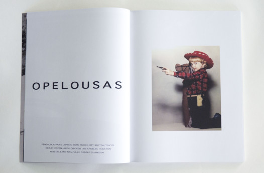
‘Opelousas’, a Marc Jacobs inspired ad designed by Micah Learned (the boy is Learned as a little one)
LKL: If the Disruptive Content serves to have a similar effect on the reader, and creates spaces and pauses between features, how is this effect different than using real ads? Is it different?
ML: My hope is that the overall, immediate visual effect of Disruptive Content is very similar to that of actual print marketing. It’s very important to us that Momma Tried be received as a magazine and not, for example, an art book. Ads are decidedly a part of magazines, and when a magazine doesn’t have them we notice for both positive and negative reasons.
For our first issue, one of the ways in which I think we’ve been most successful at exploring the possibilities of a print magazine as an artist’s medium is through Disruptive Content. We made some pretty basic spoof ads that I love, but Theo and our contributing artists like Brett LeBauve and Josh Ente also made some very fun, but critical ones. At the same time we have artists who created ads for books they hope to write or products they intend to make; there are ads for an ongoing art project that requests real letters from real people. On one page, we might be using satire to address the misogyny in an existing print marketing campaign, while on the next page, the ad might be at the service of manifesting a project for an artist. Some of my favorite ones serve a similar role as a Borges’ story, like “Pierre Menard, Author of the Quixote,” for example; in that, now that the idea is out there in the world, the actual thing doesn’t have to exist. Hopefully our readers will find these additional injections of humor and ideas more rewarding than products for sale. I guess the win-win of it all is that even if some or all of it falls flat for an individual, readers still get the initial satisfyingly familiar look of pages with real advertising.

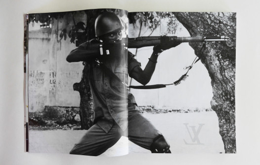
‘Bouffant Bouffant’ – Disruptive Content designed by Brette LeBauve, inspired by Louis Vuitton adverts
Theo Eliezer: For the first issue it was pretty difficult to explain what we were going for when asking people to submit possible Disruptive Content pieces, and although we had a handful of talented friends who understood the idea right off the bat (such as Josh Ente, Annie Evelyn, and Jess Pinkham), we ended up making most of the fake ads ourselves. Fortunately for us, our friend Brett LaBauve happens to already be using similar themes in his own work, as part of his ongoing collection of art and designs called Bouffant Bouffant, and we included a number of his pieces in this issue. His work pairs luxury brand logos juxtaposed with images that reference violence, sex, drugs, and over-the-top historical opulence, and the pieces typically seem to serve as commentary on the iconography of consumerism. What Micah and I are both really drawn to with Brett’s work is that, while Bouffant Bouffant does seem to hold up a critical lense to capitalism and pop culture, he also has a good sense of humor, and the work is funny and beautiful, rather than depressing.
LKL: Discuss the balance between mockery and admiration toward these iconic advertisements in mimicking the styles of recognizable campaigns. Where had you seen this done before? Who did it well? Who didn’t? How is your take on DC different?
TE: Although we’re appropriating or making reference to existing ads for a lot of the Disruptive Content, I think that for most of the ads that I designed, the absurdity of advertising was my initial inspiration. To me, what’s interesting about the place that advertising holds in print is that it is often almost completely nonsensical, but as readers, we’ve come to accept that a vague slogan paired with an image is meant to inspire desire for a product or a lifestyle, and I think there’s an inherent humor to that. Because we followed the standard model of placing “luxury” ads at the front of the magazine, I’ve seen a number of people make their way well into the first 20 pages before they realize that we have no real advertisers. I think this is because the content of most real print advertisements is absurd to begin with.
The most common example of a publication using satirical adverts is Adbusters, which is a publication that I very much admire, but our approach has been really different from theirs. Although they have amazing artists and designers contributing to their magazine, I find that I’m always in a bad mood after spending time with any given issue of Adbusters. We want to explore the humor and problematic aspects of conventional print advertising, but don’t want to leave people with a feeling of hopelessness or self-loathing after reading Momma Tried.
ML: Exactly, our hope is that Disruptive Content, whether it makes you laugh or take pause, might open up new avenues of understanding and relating to both print advertising and print magazines as a whole. We’re also hopeful that the range of “ads” printed in our first issue will encourage more artists to create and submit their own takes on Disruptive Content for Issue 2.
You can find Momma Tried for sale in Bon Castor, Defend New Orleans, Crescent City Comics, FRIEND, Gnome and online. There will be a launch party (with cake!) that is free and open to the public on Saturday, November 23 at Parse gallery, 8 pm-12 am. Momma Tried will be accepting submissions for Issue 2 until January 5, 2014.
 NOLAbeings Multimedia artist Claire Bangser created NOLAbeings as a portrait-based story project that marries...
  Voodoo in New Orleans: Reviving history: New Orleans fortune telling This article takes a deep dive into the history of Voodoo in New Orleans, its hybridization with Catholicism, and its present-day place in the city's culture. The author visits fortune-tellers in the French Quarter, using their guidance as a tool for introspection rather than a deterministic predictor of the future. Through her experiences in New Orleans, the author feels a mystical connection to both the past and the future.
[…] Hence the (hopefully) tongue-in-cheek immaturity of a fake ad—Eliezer and Learned call these “disruptive content”—depicting a woman with bottle of “Anel” perfume, preceding a powerful photo of a woman […]